Color is one of the first things customers notice about your packaging. It influences brand recognition, product perception, and purchasing decisions long before someone reads what's inside the box. Imagine spending months perfecting your brand's new logo, only to receive your first batch of custom packaging and realize your signature vibrant orange looks... slightly brown.
Many brands are surprised to learn that there isn't just one way to print color.
Two of the most common color systems used in commercial packaging are CMYK and Pantone (also known as the Pantone Matching System or PMS). While both produce high-quality printed packaging, they're designed for different purposes.
Understanding the difference can help you balance color accuracy, production efficiency, and cost. In this guide, the prepress experts at Printline explain how each system works, how your paper choice affects the final look, and how to decide which is best for your next packaging project.
At a Glance: CMYK vs. Pantone
| Feature | CMYK (4-Color Process) | Pantone (Spot Color / PMS) |
|---|---|---|
| Printing Method | Mixes four base inks (cyan, magenta, yellow, black) | Uses a pre-mixed, standardized ink recipe |
| Best For | Photographs, full-color artwork, complex gradients | Exact brand colors, logos, specialty/metallic colors |
| Color Consistency | Very good, with slight acceptable variation between runs | Excellent, absolute, and highly repeatable |
| Cost | More economical for most multi-color projects | Higher, due to dedicated spot inks and press plates |
| Typical Applications | Product boxes, retail packaging, food packaging | Corporate branding, luxury packaging, premium products |
What Is CMYK?
CMYK stands for Cyan, Magenta, Yellow, and Key (Black).
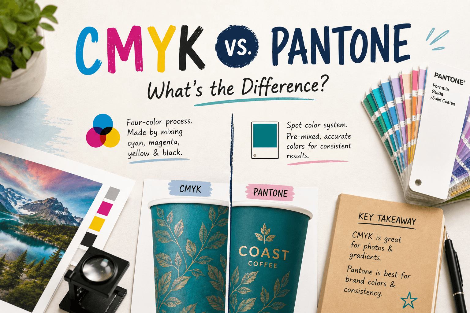
Rather than printing every individual color separately, CMYK combines these four inks to reproduce thousands of colors. If you were to look at a CMYK-printed box under a magnifying glass, you wouldn't see solid blocks of color. Instead, you would see thousands of tiny, overlapping dots of those four base colors. This process is known as four-color process printing and is the industry standard for most commercial packaging.
If your artwork includes product photography, color gradients, or complex multi-color illustrations, CMYK is almost always the most practical and cost-effective choice.
What Is Pantone (PMS)?
Pantone is a standardized color-matching system used throughout the global printing industry.
Instead of creating colors by mixing dots on the paper during the printing process, each Pantone color is manufactured as a pre-mixed ink with its own unique formula before it hits the press.
Think of it like going to a hardware store to buy wall paint. You pick a specific swatch (e.g., Pantone 186 C Red), and the ink is mixed to that exact recipe. Whether your packaging is printed today, next year, or by a different facility entirely, that specific Pantone ink will look the exact same. This makes Pantone particularly valuable when maintaining precise brand colors is critical.
CMYK vs. Pantone: What's the Difference?
Although both systems produce excellent print quality, they solve different challenges when it comes to accuracy, consistency, and cost.
1. Color Accuracy
For most packaging designs, CMYK delivers outstanding results. However, because CMYK physically mixes colors via dots, certain vibrant colors can be difficult to reproduce accurately. These often include:
- Bright oranges
- Vibrant greens
- Deep navy blues
- Fluorescent/neon colors
- Metallic finishes
When precise color matching is essential—especially for those hard-to-hit shades—Pantone offers undeniable accuracy that CMYK cannot achieve.
2. Consistency Between Print Runs
If your packaging is printed multiple times throughout the year, you'll want your signature brand color to look identical every time. CMYK is highly consistent when presses are properly calibrated, but slight microscopic shifts between production runs are normal. Because Pantone inks are standardized and pre-mixed, they completely eliminate this variation, guaranteeing an exact match every time.
3. Cost
Cost is where CMYK has the distinct advantage. Since virtually every commercial press (including Printline's offset presses) is already configured for four-color process printing, CMYK is usually the most economical solution for colorful designs. Pantone requires a dedicated printing plate and custom-mixed ink for each specific color, which increases setup time and production costs.
Can You Use Both Together?
Absolutely. In fact, many premium packaging projects utilize a hybrid approach.
For example, at Printline, we frequently print projects where the product photography is printed using the standard 4-color CMYK process, but we add a 5th "spot color" printing station specifically for the brand's Pantone logo or a metallic gold accent. This allows brands to enjoy the cost-effective flexibility of CMYK while maintaining perfect consistency for the logo customers recognize most.
Factors That Influence Printed Color (Beyond the Ink)
Choosing CMYK or Pantone is only part of the equation. The final appearance of your packaging heavily depends on the physical material it is printed on. The same ink can appear noticeably different depending on:
- Paper type: Ink absorbs differently into coated (smooth/glossy) versus uncoated (porous/textured) paper.
- Board color: A Pantone color printed on bright white paperboard will appear incredibly vibrant, while the exact same ink printed on natural brown Kraft board will look darker and more muted.
- Surface finishes: Adding a matte lamination will soften your colors, while a high-gloss UV coating will make them pop and appear more saturated.
Questions to Ask Before Choosing
Before sending your artwork to the press, consider these questions:
- Does your brand have strict color guidelines that require a 100% exact match?
- Is your logo more important than photographic imagery?
- Will this exact packaging be reprinted repeatedly over several years?
- Does your design include specialty colors or metallic finishes?
- Is staying within a strict budget a higher priority than achieving an exact, vibrant brand color?
Answering these questions early can help avoid unexpected revisions later in the production process.
The Bottom Line
Neither CMYK nor Pantone is inherently better—they simply serve different purposes. CMYK is the preferred choice for efficiently reproducing complex, full-color artwork at a competitive cost. Pantone excels when precise brand consistency is non-negotiable or when you need specialty colors that standard process inks simply can't reach.
Let Printline Review Your Artwork
Working with your packaging manufacturer during the design stage is the best way to ensure your finished packaging looks exactly as intended.
Our prepress experts at Printline are here to help. We can review your artwork files, analyze your brand colors and chosen paperboard, and recommend the most cost-effective printing method for your specific project.
Contact the Printline team today to discuss your packaging design and get a custom quote tailored to your brand!